In 2020, “Home Alone” stopped being the ever-present Christmas movie title and became our everyday reality. Confined to our homes due to the global pandemic, devoid of traveling or any alternative adventure experienced by Macaulay Culkin, we suddenly faced unpredictability as the only predictable thing. Our worlds shrank to our flats. Is this how the house in the future will look like?
Four years ago, I was standing in the streets of Tokyo, the city where the future has already arrived. In front of me, a gigantic Nakagin Capsule Tower, Kisho Kurokawa’s vision of the urban planning of tomorrow.
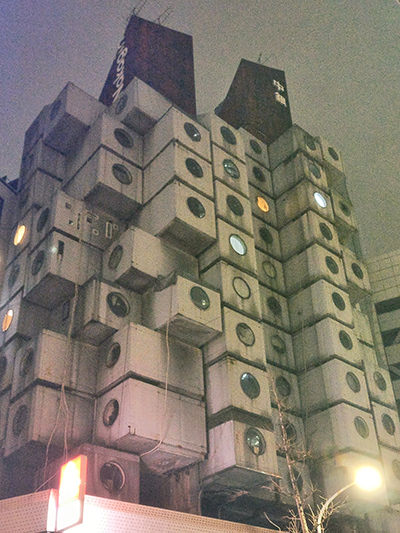
The two interconnected towers consisted of 144 prefabricated live/work capsules. Barely 10 square meters in size, these tiny homes appeared back in 1972. That was seven years before the same designer created the first capsule hotel in Osaka, which pioneered a worldwide trend in the hospitality industry.
In the ’70s, the mega-structure of Nakagin Capsule Tower in the posh Ginza district of Tokyo was presented as a vision of the house in the future. The tiny house movement was in its diapers back then, and the minimalist lifestyle had yet to spread any roots.
In 2017, I could only see the building from the outside. To check how the Japanese have shrunk their lives into capsules smaller than some bathrooms, I traveled to Vitra Design Museum in Germany, which staged the exhibition under the title “Home Stories”.
Covering a century of architecture, this prominent design museum presented 20 visionary interiors, an insight into the future ideas of the past. Or is it – past ideas of the future?
As worldwide lockdowns stopped us from traveling to faraway places, could traveling through time be an alternative? Can these visions of the house in the future help us reinvent our lives, the process we started during the pandemic?
Vitra Design Museum history
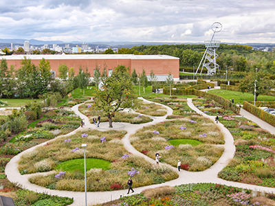
Vitra Design Museum is a part of the Vitra Campus, a production site for Vitra furniture manufacturers, but also an architecture park with a multitude of buildings by renowned world architects.
This unique complex is located in Weil am Rhein, the most southwesterly town of Germany, just at the border with Switzerland and France.
Technically a suburb of Basel, the Swiss art capital, Weil am Rhein has been competing for cultural pride with its Vitra Design Museum since 1989.
After a devastating fire hit Vitra’s production facilities in 1981, the Swiss-owned furniture company that has been in existence since 1957 decided to turn over a new leaf.
Rolf Fehlbaum, the eldest son of Willi and Erika Fehlbaum, the founders of Vitra, took over the management of the company and established Vitra Design Museum. He imagined it as a place for displaying their growing collection of chairs and other furniture, but also for presenting internationally acclaimed exhibitions of design and architecture.
In 1989, the Vitra Design Museum, the first European building of the American architect Frank O. Gehry, was only a start. In the following decades, numerous works by famous world architects would transform Vitra Campus into a place that celebrates an architectural adventure.
Zaha Hadid, Tadao Ando, Álvaro Siza, Jean Prouvé, Herzog & de Meuron and SANAA are the names whose signature you will manage to find in this impressive park.
From a company that built its business on cult items such as Eames Lounge Chairs by Charles and Ray Eames, and Panton Chairs by Verner Panton, Vitra became a synonym for an iconic collection of contemporary architecture.
As for the Vitra Design Museum, it tried to broaden global horizons, first under the director Alexander von Vegesack (until 2010), then co-directors Mateo Kries and Marc Zehntner (2011-2020). Today, Mateo Kries directs the institution on his own.
When in Weil am Rhein, make sure to visit the museums in Basel, too! Some of the best art museums in Switzerland are just several tram stops away!
From Zaha Hadid Fire Station to VitraHaus furniture story
Before exploring the visionary interiors of Vitra Design Museum’s “Home Stories”, it’s impossible to oversee the fantastic exteriors of Vitra Campus.
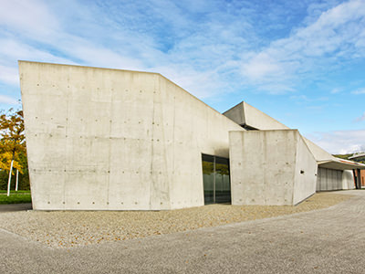
Vitra Fire Station by Zaha Hadid at the southern entrance to the complex is the first one to catch one’s attention. It was obvious why Vitra owners wanted to have their own fire brigade after the 1981 disaster. But today, this sculptural structure from 1993, the first-ever building of the famous Iraqi architect, mainly serves as an event venue.
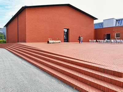
Right next to Zaha Hadid’s gray Fire Station, a fiery red Vitra Schaudepot from 2016 is a vivid contrast. Behind the brick walls, work of Jacques Herzog and Pierre de Meuron, the windowless building hides one of the most important furniture design collections in the world. It consists of more than 8000 objects!

The Álvaro Siza Promenade then circles around the Factory Building the Portuguese designed in 1994, passing by Vitra Slide Tower added in 2014. The 31-meter high observation tower, created by German artist Carsten Höller, includes a spiraling tube slide, a giant clock, and a viewing platform.
The path follows through the park sprinkled with smaller creations such as Thomas Schütte’s Blockhaus, Renzo Piano’s Diogene, or Ronan & Erwan Bouroullec’s Ring. However, VitraHaus clearly overshadows them all.
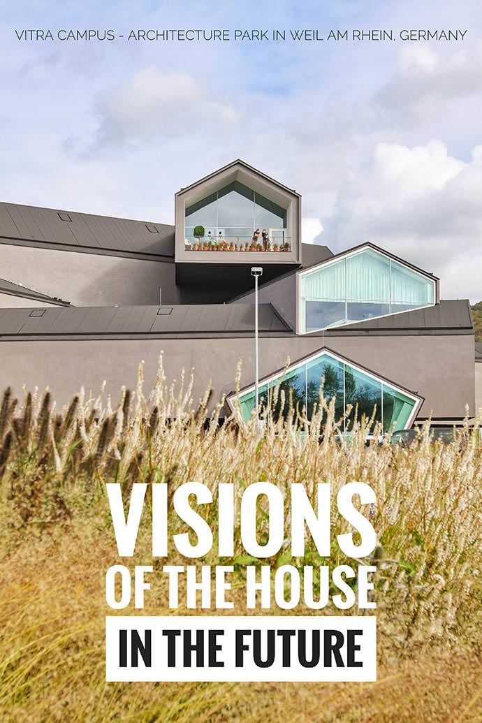
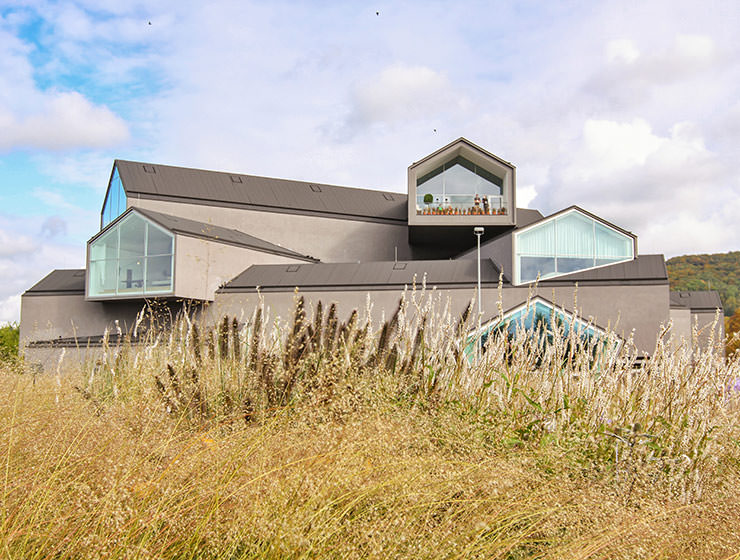
Designed by Basel-based architects Herzog & de Meuron in 2010, Vitra House houses Vitra Home Collection, the store where you can try and buy your choice of furniture and accessories. The idea of stacking house volumes on each other reminded me of that Kurokawa’s Tokyo tower concept which inspired this article journey. VitraHaus was confirming that some ideas of space usage definitely survive the test of time.
Frank Gehry’s Vitra Museum – a curled up phoenix
Unless you continue further towards the Balancing Tools sculpture erected here in 1984 by Claes Oldenburg and Coosje van Bruggen, and the Conference Pavilion, Tadao Ando’s first work outside of Japan (1993), your walk will finally bring you to Vitra Design Museum (1989) and Vitra Design Museum Gallery (2003), both signed by Frank Gehry.
Vitra Design Museum, as the first public building on the campus, was a turning point in the development of the project. They built it with the assumption that opening the doors to a general audience will popularize design and architecture. Today, the campus magnetically attracts more than 300 thousand visitors every year.
What started with a lightning bolt that swallowed Vitra Campus in the blaze in one sad night of 1981, became an opportunity for remodeling a new world out of ashes
In front of the building, a human snake. Visitors obediently wait for their turn to enter Vitra Design Museum. Slowed down by the epidemiological measures, cultural experience has become a privilege worth the patience.
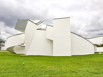
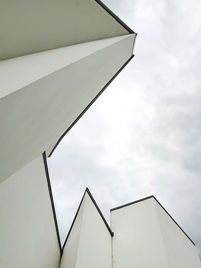
Socially distanced guests winding at the entrance almost complement the swirling of the white curved forms Gehry introduced in his premier European work.
What started with a lightning bolt that swallowed the campus in a blaze in one sad night of 1981, became an opportunity for remodeling a new world out of ashes. The fluid architectural work of the American Deconstructivist reminds me of a nested phoenix that speaks volumes with volumes.
Alison and Peter Smithson – House of the Future
“Our homes are an expression of the way we live, they shape our everyday routines and fundamentally affect our well-being.” Vitra Design Museum curators say this at the beginning of “Home Stories”, the exhibition that traces the evolution of the contemporary private interior.
Between the omnipresent Ikea seducing us with catalogs of “democratic design” since 1951 and the totemic Carlton room divider/bookcase by Ettore Sottsass from the Monte Carlo apartment of late Karl Lagerfeld in 1983, something in between captivated my attention.
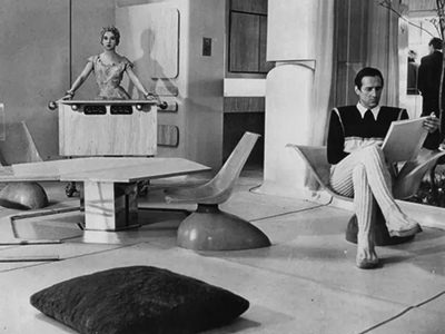
The English architects Alison and Peter Smithson proposed their House of the Future in 1956. The project was their contribution to the theoretical debate about how the conventional suburban home would look like 25 years later, in the distant future of 1981.
In post-war Great Britain, at Daily Mail’s Ideal Home Exhibition in London, these New Brutalists proposed a house designed around a courtyard garden.
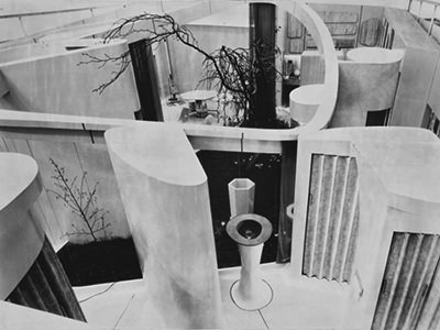
Their House of the Future did not need windows as it opened up to the natural lighting from above. Windowless houses would enable placing them side-by-side, which would probably make the management of urban space more economical. But it is not clear how the architects imagined the coexistence of such large open spaces with English weather.
This futuristic idea of Alison and Peter Smithson proposed a hybrid between a Stone Age cave and a spaceship. The curved walls were defining the living quarters of a young, childless couple. In tune with then widespread passion for new technologies and simplification of housework through automation, they basked in innovation.
The House of the Future came with an electrostatic dust collector at the entrance, a self-cleaning bath, an after-shower body air drier, and a sophisticated electro-acoustic communication system inside and outside the house. Calls were broadcast over loudspeakers instead of phones, and there was even a telephone message recorder.
Frankfurt kitchen as women’s laboratory
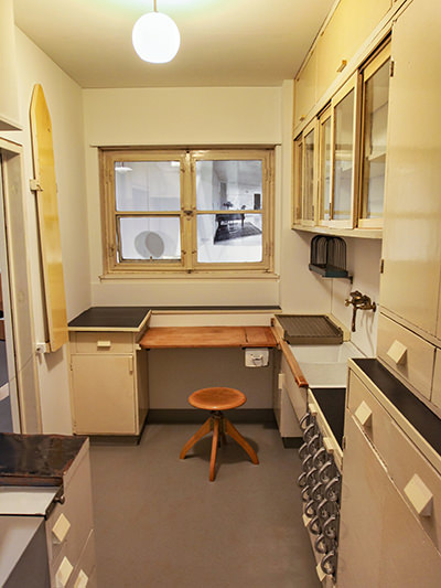
The importance of the functionality of interior design was apparent even after an earlier crisis, World War I. In the 1920s, designers sought an open and flowing living space. They saw decoration and ornaments not just as esthetic faux-pas, but also adverse for practical and hygienic reasons.
New Frankfurt (Neues Frankfurt) was one of the largest answers to the housing crisis in Europe in that period. The city commissioned architect and urban planner Ernst May to head this housing project on the green periphery of Frankfurt in 1926. It resulted in 10 thousand apartments that aimed to eliminate the housing shortage.
To nullify the class boundaries, as well as to secure the lower costs to the project, May & co. introduced the serial production that was typified.
For standardization of the kitchen, Austria’s first professional female architect was engaged. Margarete Lihotzky came up with a modular system that was a compact cooking workstation, measuring just 1.9 x 3.4 meters.
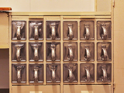
The famous Frankfurt Kitchen was the result of industrially approved optimization processes. Time-motion scientific studies of food preparation secured the efficiency of the kitchen layout. The reduction of the floor space was advertised purely as an ergonomic benefit for women. Nobody was mentioning the economic reasons of mass-production behind this choice.
“A kitchen is nothing but a laboratory”, Margarete claimed, “and it would be much better to work in if it was regarded as such and if it were somewhat furnished in this way. It would have to look a bit like a pharmacy, where every little bottle and every trifle has its designated shelf, with precise inscription, possibly even everything made to measure the same dimensions.”
Science also claimed that blue and green repel flies, so surfaces in the world’s first fitted kitchen were painted in these colors.
Nixon-Khrushchev Kitchen Debate
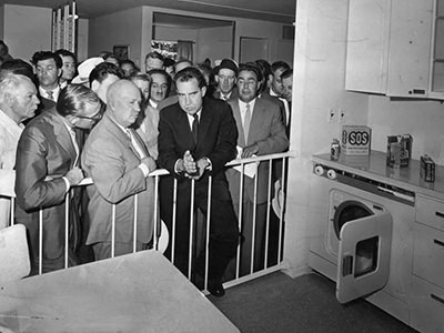
The kitchen, that focal point of our comfort-inducing lockdown hobbies, was in the center of heated discussions in the Cold War era too.
American vice-president Richard Nixon met the Soviet first secretary Nikita Khrushchev at the American National Exhibition in Moscow in 1959. The verbal rivalry between “the lawyer of capitalism” and “the lawyer of communism” at the summer showcase of American industry entered history as the Kitchen Debate.
Nixon tried to demonstrate the higher standard of living in the USA by boasting with the newest labor-saving appliances in the prefabricated model house. He claimed that anyone in America could afford such a house.
Khrushchev responded that those were built to last only 20 years so that capitalist builders could sell people new homes. On the other hand, he insisted that USSR was building houses that last three generations.
The encounter of the two leaders among the refrigerators and electric stoves had been recorded in color TV, another example of American superiority.
“I want to show you this kitchen. It is like those of our houses in California”, said Nixon while pointing to a dishwasher.
“We have such things”, quickly discarded the bragging Khrushchev.
“This is our newest model”, Nixon persisted. “This is the kind which is built in thousands of units for direct installations in the houses. In America, we like to make life easier for women…”
“Your capitalistic attitude towards women does not occur under Communism”, Khrushchev cut him off.
The Soviet leader mocked American gadgets. It is easier to squeeze the juice out of a lemon by hand than using the lemon juicer, he claimed. “Don’t you have a machine that puts food into the mouth and pushes it down?”, ridiculed Khrushchev.
American products of the future sounded interesting, but the communist was asking: were they really needed in life?
Homo movens in stacked tiny homes
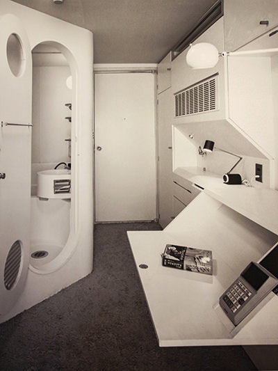
Traveling through bits and pieces of modern interiors’ birth certificates brought me to Kisho Kurokawa’s famous capsules from 1972.
His Nakagin Capsule Tower came about after a group of young Japanese architects and designers presented their Metabolism manifesto at the 1960 World Design Conference in Tokyo.
Kurokawa and other Metabolists were proposing a new form of urban planning and architecture. They imagined individual homes as transient elements of the urban infrastructure, just like leaves are for a tree.
The capsule was imagined as a dwelling for homo movens, an urban nomad who works until late or doesn’t have family ties. The 1970s predecessor of a digital nomad doesn’t have many belongings and thus can fit into one of the dozens of tiny capsules clipped together.
The futuristic living pods were tested in real life. Five decades ago, the 13 floors of Nakagin Capsule Towers were erected in just 30 days!
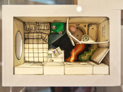
At Vitra Design Museum, I managed to take a peek into a cardboard model of these capsules, made by Charlap Hyman & Herrero in 2020. Indeed, they seemed to be compact flats that could fit a double bed, a small bathroom, and a wall of appliances and cabinets in 10 square meters.
The capsule is a cyborg architecture in metapolis, aimed towards a pluralistic society, imagined the manifesto of Metabolists.
The mass-produced unit that could be individualized was indeed at the forefront of the movement that will see living and working space as temporary surroundings in the larger image of what life is.
This vision of minimalism as a founding ground for dynamic cities of the future was quite advanced and innovative. Plus, these charming recyclable cubes had windows, unlike Smithson’s House of the Future.
Celebrities as cavemen in Cecil Beaton’s house
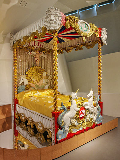
Then there is, of course, something radically different – opulence.
An ambitious British photographer and designer Cecil Beaton leased a Georgian manor house in his late 20s.
From 1930 to 1945, Ashcombe House in Wiltshire was not only the living space for his theatrical personality but also a site of lavish social gatherings. Greta Garbo, Salvador Dali and Queen Elizabeth are just drops of crème de la crème that were visiting Beaton’s fanciful universe.
The house had eye-catching furniture that was invoking Rococo and Baroque, but it also playfully celebrated the absurd, with candle holders in the form of human arms or bass drums he repurposed as side tables.
Vitra Design Museum exhibited the reproduction of his golden Circus Bed embellished with unicorns. Heading to sleep in such an unusual piece of furniture must have resembled jumping on a fairground ride.
Unlike Kurokawa’s capsule houses, Beaton did not see the home as a place to come for a short sleepover after a long day of work. Ashcombe House was a tool of an elevated esthetical and social experience.
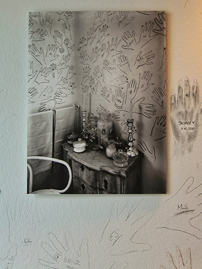
Besides signing the visitors’ book, Beaton’s guests would also leave the marks of their hands on the bathroom wallpaper. Like ancient cavemen, these famous people were reaffirming their participation in a unique experience, almost saying “I was here”.
Following up on this tradition, Vitra invited its guests to leave their handprints on the museum wall, confidently exhibiting the idea that the contribution of passers-by cannot jeopardize, but instead enrich the relevance of an institution.
Visions of the house in the future – Conclusion
Since the Stone Age, our homes were caves where we were finding security. The home design had to serve its basic function: keeping us warm, protecting us from the outside enemy, and so on.
In 2020, #stayhome became a hashtag of our modern existence. Instead of bears trying to eat us, an invisible virus made us retreat in between our four walls. Gathering around the kitchen stove like prehistoric people around the fire, we were finding comfort in togetherness, and just trying to survive like we always had.
Our living quarters reflect not just esthetical choices, but also social, cultural, and existential aspects of our identity
In the world of closed cinemas, movies about dystopian societies triumphed on streaming services. As always, we played with predicting the future and consoled ourselves that it can always get worse.
With no social situations where one could expose the status through luxury objects, clothes, or travel experiences, our pajamas-clad everyday life at home has given us the privilege to think about the necessities of good living.
How can we design our lives and our homes in a way where they can serve their purpose in the future too? Between clutter and minimalism, between square footage and meaningful content, can we find that satisfying balance?
Vitra Design Museum brought questions we had about home stories in the past century. Some of these interiors definitely tackle today’s wonderings about the visions of the house in the future too. It’s a relevant reminder that our living quarters reflect not just esthetical choices, but also social, cultural, and existential aspects of our identity.
In 1924, the pioneer of modern architecture Ludwig Mies van der Rohe said: “Architecture is the will of the epoch translated into space. Lively, changing, new.” A century later, this evergreen definition can support the designing of our next home stories too.
Vitra Design Museum Facts
Vitra Design Museum address
Charles-Eames-Str. 2, Weil am Rhein, Germany
How to get to Vitra Design Museum?
Vitra Design Museum’s location is easily reachable from Basel. Tram line 8 terminates in Weil am Rhein. From there, you can reach Vitra Campus by heading north along Müllheimer Strasse. The walk will take you about 15 minutes.
From Basel Badischer Bahnhof train station, you can also take bus no. 55 to bus stop Vitra, or the Deutsche Bahn train to Weil am Rhein.
Vitra Design Museum opening hours
Vitra Campus is open from Monday till Sunday, from 10 am till 6 pm. However, at the moment of publishing this article, Vitra Campus is closed for visitors due to the current situation with COVID-19. Before visiting, always consult the Vitra Design Museum website first.
The good news is that you can visit Vitra Design Museum virtually too. #VDMHomeStories is the museum’s digital initiative that provides a visual experience of the collection.
Selected objects with background information can be found in the Online Collection.
You can find exhibition films and talks on Vitra Design Museum Youtube.
Director Mateo Kries and museum curators make live conversations with various guests on Vitra Design Museum Instagram.
Vitra Design Museum Facebook account is another place to join the discussion about the museum and its collections.
If you are looking for cool souvenirs and gifts, consider visiting Vitra Design Museum online shop.
Vitra Design Museum entrance fee
Vitra Design Museum ticket costs 11 Euros, while Vitra Schaudepot costs 8. The combined visit to both will be 17 Euros.
Reduced prices are available for underage persons, students, seniors, disabled persons, groups of more than 10 people. Children under 12 years of age can visit the Vitra Design Museum free of charge.
What is your vision of the house in the future?
Share your thoughts in the comments section below!
If you liked this article on Vitra Design Museum and Vitra Campus, pin it for later!
