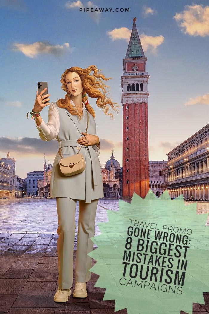
Sandro Botticelli must be turning in his grave. His famous painted Venus went through a surreal rebirth – now as a virtual influencer. For the needs of Italy‘s newest tourism campaign “Open to Meraviglia” (“Open to Wonders”), she is seen taking selfies in Venice, riding a bicycle in Rome, and eating pizza at Lake Como. But “The Birth of Venus” is not the only borrowed thing in this promo video. The Italian tourism marketing campaign features an embarrassing mistake: footage from neighboring Slovenia.
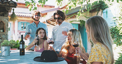
Young people laughing and sipping wine is a scene authors want us to believe portrays an Italian way of life. But eagle-eyed viewers recognized the Slovenian village of Gorjansko. To make the fiasco complete, the actors drink wine with the label from a Slovenian vineyard. In this day and age, when social media watchdogs can dissect every frame of any video, it was only a matter of time before someone caught the gaffe.
Mistakes in tourism marketing are costly, in terms of reputation and money
However, Italy is not alone in the tourism marketing blunder department. The embarrassing mistakes in tourism campaigns happen more often than the industry would like to admit.
Sometimes, they are a result of laziness, ignorance, or a simple oversight. On other occasions, they are a deliberate attempt to mislead because “nobody will notice”.
But regardless of the cause, the mistakes almost always lead to ridicule and mockery and can harm the reputation of the destination involved.
The mistakes are costly in terms of money too. Italy, for instance, will pay 9 million euros to the Armando Testa communications group for this campaign. The art historian Tomaso Montanari already called the result grotesque, and an “obscene waste of money”.
Italians may be feeling a little red-faced at the moment, but they can take some comfort in the fact that there are plenty of other tourism campaigns out there with their fair share of embarrassing mistakes. To cheer them up, we share some of the best ones. Or is it – the worst ones?
Lost in translation – Italian cities get AI makeover

Besides the concept, inauthenticity issues, and a linguistic mish-mash of the name “Italia - Open to Meraviglia”, the Italian Tourism Ministry’s campaign website Italia.it also managed to embarrass itself in the translation department.

Apparently, by delegating this task to a less-than-stellar translator – an artificial intelligence, the new names of Italian cities were delivered to German audiences.

After all, who wouldn’t want to visit Toast instead of Brindisi, or take a stroll in the beautiful city of Lawn formerly known as Prato? Poor Fermo was translated as Stillstand, Cento became Hundred, and Camerino ended up as Garderobe, or – a dressing room. Oh, mamma mia!
8 most embarrassing mistakes in tourism campaigns
1. Croatia promoted with the footage from Norway
Croatia – where the mountains are so picturesque as if they have come out straight out of a Norwegian fairytale! Well, wait a minute…
In 2022, Croatian National Tourist Board promoted the Month of Croatian Tourism, a marketing campaign to enable cheaper holidays in October for locals.
While the voiceover in the video invites viewers to “travel Croatia with numerous great discounts”, we can see a train winding its way through a lush mountain forest. But instead of the train line Zagreb-Split, the picturesque footage shows the line Oslo-Bergen, in – Norway!
No way, you would say. But hell yes way! Croatian tourism campaign used the shot from faraway Scandinavia to make Croatia more attractive to its citizens.
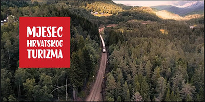
The tourism board was quick to wash their hands, saying that they were not informed that the train was not shot in Croatia. BBDO Zagreb agency, which cashed in 68.515 euros for this creative stunt, explained that it had to purchase the footage from Norway on Shutterstock because the weather was just not nice enough on the days they were filming at authentic Croatian sites.
“Due to schedule and budget constraints and bad weather conditions in December, it was not possible to take aerial footage at the location that would attractively show the beauty of Croatia”, they explained.
And by the way, December they’re mentioning was in 2019. They were shooting the video three years before it aired. So when they say “schedule restrictions”, it’s a relatively broad definition of the term. As for meteorology, Croatia saw three hot summers since then.
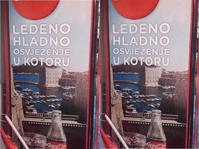
To nivelate things out, we can also point out Coca-Cola‘s epic promotion failure in Kotor, a coastal town in Montenegro.
With the message “Ice cold refreshment in Kotor”, the ad showed the famous drink with a backdrop of the Croatian town of Dubrovnik. As they would say in the beverage giant: it’s the real thing!
One Croatian organization intentionally employs humor to promote its key messages. Check out how funny safety marketing can be!
2. Syria promoted with the soundtrack of Seven Kingdoms
As we briefly visited King’s Landing, let’s stay a bit more in the mystical land of Westeros, with imaginary vistas you might have not expected.
In 2016, amidst the brutal Syrian Civil War, the government got a bright idea: inviting tourists to the war-torn city of Aleppo.
For this marketing campaign, bomber airstrikes were replaced with drone aerial shots, highlighting pristine parks, mosques, and even swimming pools.
Only the regime-held west Aleppo was featured in the campaign, as the heavily-bombed eastern part of the city would not be the prettiest tourist sight.
The main attractions of the city before the war, now badly damaged Aleppo Citadel and the Old City, listed as a UNESCO World Heritage site, have conveniently been excluded from the romantic panorama.
The surreal video wishes you a welcome to one of the least safe places in the world with the message “Aleppo… Will of Life”. It’s so poetic, that one cannot figure out if the ‘will’ here means a ‘determination’ or a ‘testament document’.
But for the full experience of this outlandish tourism marketing campaign, one needs to turn the volume up, as the peculiar city portrait comes with the iconic “Game of Thrones” theme song playing in the background. The idea of tourism at the most dangerous corner of the planet is so bizarre that the soundtrack and the context of a fantasy drama about war and dragons fit almost like a glove.
While the marketing campaign of the Syrian Tourism Ministry was more a political message than an unfortunate mishit, it still showed that appropriation of inauthentic material can’t make tourism in a war zone look appealing.
The year 2024 has started with some atypically creative tourism campaigns. Check them out!
3. Greece promoted with the footage from Australia
Greece also looked for inspiration for its tourism marketing campaign on another continent. Well, at least not an imaginary one.
In a 2016 video, titled “Gods, Myths and Heroes”, the Greek National Tourism Organisation decided to show historical sites such as the Parthenon, Olympia, and Delphi, but also the natural beauties of their country.
For the 12-minute tourism short, among a thousand Aegean islands, the Greeks picked the likes of Santorini, Mykonos, Delos, and… the Twelve Apostles? Well, to be fair, the narrator did mention the “islands off the beaten track, unmentioned in guidebooks”.
It took 15 seconds of the timelapse shot from 15.000-kilometer-far Australia to stir the pot. As it turned out, Alex Cherney, the author of the borrowed footage, didn’t even give his permission for the use.
The appearance of the impressive natural rock formation off Victoria’s coast in a Greek tourism video got even more confusing when the tourism board tried to defend its action down under. As they explained in their rather creative statement, they didn’t aim at the Twelve Apostles, but at the skies above them.
“Almost all the world, wherever you turn around your eyes, you will meet an idea, a name, that originated from Greece. Even the skies of Australia in the southern hemisphere… You will see stars and constellations that carry Greek names. The mythology of the sky at all latitudes and longitudes of the Earth is Greek”, they said.
There you go, the tourism marketing campaign authorized by the heavens themselves! Greece takes a stance at defending its title of the land of myths and legends.
We won’t even jump on a sneaky little detail that the 75.000-euros worth video opens up with a scene shot in – New York. Probably, there was a reflection of the Greek skies in American skyscrapers.
Turkaegean campaign

In 2022, Turkey unveiled their latest tourism campaign titled “TurkAegean, Coast of Happiness”. Even the EU approved the trademark of the name, although the Aegean name and culture is associated with Greece for centuries.

Adding to the tension between the two countries that share the sea and the interest in the exploitation of the eastern Mediterranean, the Turkish campaign leaned heavily on Greek culture. The Turks stepped on their neighbors’ toes by highlighting typical Greek elements, such as the sound of bouzouki, and ancient Greek sites on Turkish territory such as Ephesus.

It’s time to stop associating the region exclusively with Greece, Turkey openly stated with its tourism campaign.

But just like Greece managed to change the name of an entire country (Macedonia had to be renamed North Macedonia in 2019), this battle over Aegean identity is surely far from finished.
4. Rhode Island promoted with the footage from Iceland
The year 2016 was a good year for tourism campaign woes. The US State of Rhode Iceland, and that is an intentional typo, confused the viewers with their break-from-reality video.
The Rhode Island promo draws you into its meditation with a soothing voice: “Imagine a place that feels like home, but holds enough uniqueness that you are never bored.” It then shows you a skateboarder performing a trick in front of the Harpa Concert Hall and Conference Center in Reykjavik.
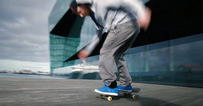
Wait, what? Did we just magically teleport, with the help of suggestion? The imagined place that feels like home turned out to be the real island, on the other side of the Atlantic Ocean – the country of Iceland.
The narrator finishes the touristic promo ad with another poetic description: “We wake up to every new dawn with young eyes, tomorrow always on the horizon.” But by then, we already know, that’s not tomorrow on the horizon. What you imagine seeing at dawn is a European country!
To soften the international controversy, the campaign also showcased eateries from the neighboring state of Massachusetts. The narrator was again on point: “Our food… We are true foodies. Did we mention our food?”
Under a strange new slogan “Cooler & Warmer”, that irresistibly reminds of a child’s game where someone hides something, and the others search for it, the Rhode Island tourism campaign just felt as lost as a tourist without a map.
The Rhode Island Commerce Corporation first tried to save face by asssuring that the entire video was indeed shot in Rhode Island. Eventually, they had to come clean and confirm the error.
Just like in the Croatian case, the state blamed the advertising firm for editing. But IndieWhip had a creative explanation of why the stock shot was included. And no, it had nothing to do with the weather forecast: “The footage in question is of a Rhode Island skateboarder, filmed by a Rhode Islander skateboarder.”
Well, that’s one way of shouldering the blame. At least, the state agency’s chief marketing officer Betsy Wall took responsibility for a $22.000 video mistake and resigned.
In 2008, Birmingham City Council in England used the skyline of Birmingham in Alabama in their leaflet. Places that share identical or have similar names can often lead to destination mix-ups. Read the confessions of travelers who traveled to the wrong cities, countries, and even continents!
5. Lithuania promoted with images from Norway, Finland and Slovakia
‘Well, if everyone is doing it, we might take a plunge too’, Lithuania might have thought before, also in late 2016, executed a salto mortale with an extremely embarrassing tourism campaign mishap.
Facebook and Twitter feeds were overflooded with photographs promoting the Baltic tourist destination. The only issue was that the pics were taken in countries such as Slovakia, Finland, and Norway. The ROFL element in it all? The campaign’s tagline was “Real is Beautiful”.
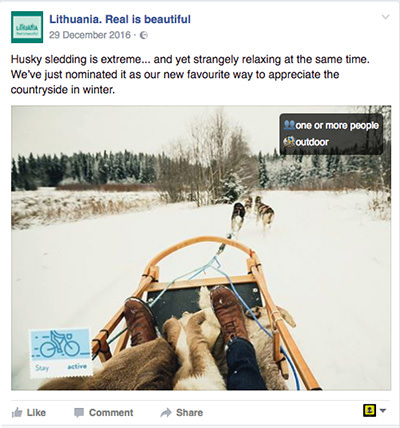
‘Somebody had to be joking’, was probably your first thought. But deadly serious, the co-winning company Turinio Rinkodara (whose name in Lithuanian translates as ‘content marketing’) claimed that the source of the content is not that relevant. CEO Kamile Jonikaite explained that “these particular photos are aimed at conveying emotion related to the winter entertainment, the location plays no role and it’s impossible to identify if it’s Lithuania, Latvia or Slovakia”.
However, people did the impossible and identified the photographs were coming from Shutterstock, Flickr, and other inexpensive sources. The frozen lake in Lithuania? Nope, that’s Oslo. Husky sledding in the countryside? Yes, but in the Finnish countryside.
Turinio Rinkodara and Open Agency received 140.000 Euros for their effortless fiasco in promoting Lithuanian beauties from everywhere but Lithuania.
The result was viral, but not in the way they were hoping for. Lithuanians started trolling the deceptive campaign by geotagging images of the Eiffel Tower, Grand Canyon, or Athens Acropolis, as Lithuanian landmarks.
The Lithuanian capital with river Vilnia. #RealIsBeautiful #alternativefacts https://t.co/pRgACsRADl pic.twitter.com/FOa2icIQOC
— Johan O (@esbjott) February 10, 2017
Even prime minister Saulius Skvernelis jumped onto this mocking bandwagon against the fraudulent tourism campaign. He posted the picture of the EU Commission headquarters in Brussels, with the caption “From tomorrow, we start working in the new government building in Karoliniskes”. For those not in the know, Karoliniskes is a Soviet-era residential suburb of Vilnius, Lithuania’s capital.
Jurgita Kazlauskiene, the chief of Lithuania’s State Department of Tourism, resigned in disgrace, a couple of hours after the debacle with stock photos became obvious.
6. Nepal promoted with the image from Thailand
Just like Pipeaway showed by exposing a fake heart island in the Caribbean, whose photoshopped image Travel + Leisure purchased from Getty Images, one should not trust that everything that appears on a stock agency website is legit. And that’s not even taking into account the rise of AI-generated images that can create convincing fakes with alarming ease.
In 2019, Visit Nepal 2020 secretariat learned the photo faux-pas lesson the hard way. They purchased images on Shutterstock and used them for a series of promotional banners in the London underground.
While some ads promoted hiking, rafting, and temple hopping, the one that caught the most attention was showing young monks praying before a Buddha statue. The poster was accompanied by the message “Talk to the Gods”, and the tagline “Vipassana meditation – Nepal”. The issue? These were the Theravada monks from Thailand.
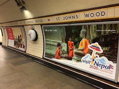
Institutions again didn’t know how to deal with the hot photo potato. The Embassy of Nepal in London had no idea how the banners even appeared on the Tube. Nepal Tourism Board also said they were not involved in these promotional activities.
The culprit was finally found in Visit Nepal 2020 secretariat, which probably should have been obvious since their name was plastered all over the ads. This puzzling tourism campaign flub was explained by the fact that the secretariat was run by – new staff.
In their defense, the photograph on Shutterstock did come with the tags such as ‘Nepal’ and ‘Nepalese’. Keyword stuffing is a common method used by photographers to raise the visibility of their work.
But that’s no excuse for not doing due diligence. Just because it’s available online, doesn’t mean it should be trusted. The phrase “buyer beware” is more relevant than ever.
7. Thailand promoted with the image from Scotland
As if Thailand doesn’t have enough white sand beaches, in 2009, the authorities decided to spice up their marketing by showcasing Kai Bae Beach destination with an image of Berneray Island in Scotland.
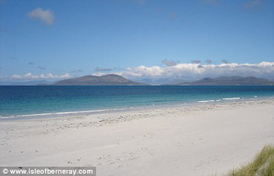
If you’ve ever wondered about the meaning of the Thai-English phrase “same same, but different”, the beach in United Kingdom’s Outer Hebrides is the poster child for the term.
While the chilly island has nothing to do with the Thai tropical zone, its appearance is similar enough that it ended up being used as promo material for the Mu Koh Chang National Park.
The goof was first spotted by Ian McNamara, a British expat running a guesthouse on the Thai island, after he saw the photograph displayed in the local tourist center. The photo was promising distant mountains in the background, but when he stood on the beach, he couldn’t locate them with the naked eye. Everything was alright with Ian’s eyesight, however. Harris Hills were nowhere to be seen for a good reason; they were in Europe.
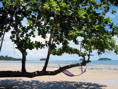
So how did this happen? It seems the Thai creatives plucked the Scottish image from the website Isleofberneray.com.
The folks in the land of kilts and bagpipes took the whole ordeal with humor. The original author John Kirriemuir was not too fussed about the steal, neither was Visit Scotland whose spokesperson called the misleading borrow a flattering “compliment in disguise”.
8. Philippines promoted with the logo of Poland
If you don’t approve of stealing stock material, why not appropriate another country’s visual?
In 2010, the Department of Tourism of the Philippines launched its new big idea – “Pilipinas Kay Ganda” (“Philippines, So Beautiful” in Tagalog). You probably don’t remember it as it was very quickly replaced by the brighter “It’s More Fun in the Philippines”.
The problems started when someone noticed that Poland has a strikingly similar logo. Underlined with stylized waves, and with a tree-shaped letter ‘L’, the resemblance was hard to ignore. Well, the difference was that there were no palm trees in Poland, so they had an oak or something more European.
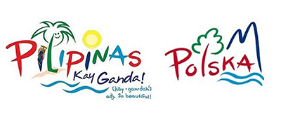
If you see an obvious steal in the creation of Campaigns & Grey advertising agency, the Philippines tourism undersecretary Enteng Romano would tell you that you might not be a graphic design professional: “There is no plagiarism. There are enough elements in the Pilipinas logo to differentiate it from that of Poland. The color scheme and visual elements are markedly different.”
His boss Alberto Lim also called the Philippines logo more colorful but admitted the similarities, and resigned.
This embarrassing tourism marketing campaign had another controversy because the homepage of beautifulpilipinas.com was just one letter away from a certain adult website. Talk about awkward! Today, the domain is on sale, where good ideas eventually never end up.
Update July 2023: Oops, they did it again

On the 27th of June 2023, the Department of Tourism celebrated its grand 50th anniversary by launching a new tourism campaign, under the slogan "Love the Philippines".

In a matter of days, the story backfired as it was revealed that the advertising agency DDB Philippines used stock footage for the campaign that the government was ready to support with $900,000.

Those majestic rice terraces that stole your heart? Shot in Ubud, Bali. Loved the sand dunes? Shot in Brazil and the United Arab Emirates. If you hoped to witness that fisherman casting a net, you'd have to visit Thailand. The plane in the video landed at Zurich Airport in Switzerland, and even the pod of dolphins having a cameo appearance never graced the waters of the Philippines.

The tourism minister Christina Frasco said that the new branding campaign was the response to the needs of post-pandemic tourists who seek "authentic interactions with communities". So far, it's been only quite an authentic flop.
Check out the “Love the Philippines” video that DOT has removed in the meantime.
Open to blunders – tourism marketing flops, conclusion
Tourism marketing campaigns come with their set of challenges, but the biggest one seems to be this fine line between being inspired and straight-up stealing.
Just like a bride on her wedding day, tourism departments have a superstitious formula. They want something new, something old, something borrowed, and something blue. But instead of good luck, they end up with a PR nightmare.
Embarrassing marketing campaigns become a source of endless entertainment, but they also backfire against their creators
Italy, a country with 200 thousand wineries, could have easily filmed its promo video at home, especially with a 9-million euro budget. But someone decided that the cheap stock video of a Slovenian wine party looks good enough, and keeps more money in the pockets of creators.
You don’t like it? You’re just a snob! This is at least the etiquette the far-right Italian tourism minister Daniela Santanche used for the critics of the “Open to Wonders” marketing campaign. The whole idea with Venus as an influencer, she said, was aimed at attracting young people. And if you have anything against it, maybe you’re just old-fashioned.
Tourism marketing professionals can be as defensive as they want to be. But as we’ve seen in the last fifteen years, they can create a tragicomedy of errors, a veritable smorgasbord of sometimes cringe-worthy blunders.
To promote the authentic experiences of their destinations, tourism campaigns steal videos, images, and even logotypes from others, eventually always falling flat on their face. What were they thinking?
The vigilant big brother of social media sees everything, and such deceitful campaigns experience a bigger flop than a soufflé left in the oven too long.
Embarrassing campaigns become a source of endless entertainment, but they also backfire against their creators. The marketing officers responsible for the mishaps may wish they could hide and never be found again. But their misdoings always end up as fodder for internet memes.
A simple “oops” is not enough of an excuse for incorrect tourism footage that plays with identities people see as their own. Maybe the world after all is not – open to blunders.
Did you like this article on the most embarrassing mistakes in tourism marketing?
Pin it for later!



How does this happen? I have seen those Nepal ads and admired them. Funny, but certainly problematic for the agencies and companies involved. Any tourism group should really first invest in great images and videos to showcase their destination.
Thanks for sharing your thoughts, Alan! It is indeed surprising how such mishaps can occur in this age of technology and easy access to information. While it’s true that investing in high-quality content should be a priority for tourism groups, it’s also important to ensure that the content is authentic and relevant to the destination being promoted. Using generic or unrelated images can lead to confusion and ultimately hurt the reputation of the destination.